
Uncategorized
How to Choose the Right Print for Your Dress
Jul
Style Tips · Print Guide
How to Choose the Right Print for Your Dress (Without Getting It Wrong)
5 min read · By Sohitravel Editorial
A printed dress is one of the easiest ways to look interesting without trying — but picking the wrong print for the context (or for you) is equally easy. Here’s how to get it right every time.
Prints do something a solid dress can’t: they draw the eye, create movement, and add personality without any accessories required. But they also require a slightly different approach to styling — because the print is already doing work, you need to let it do that work rather than competing with it. Understanding what different prints do is the first step to choosing one that works for you.
The Print Categories and What They Say
Florals
The vibe: Romantic, feminine, celebratory — and perennially appropriate
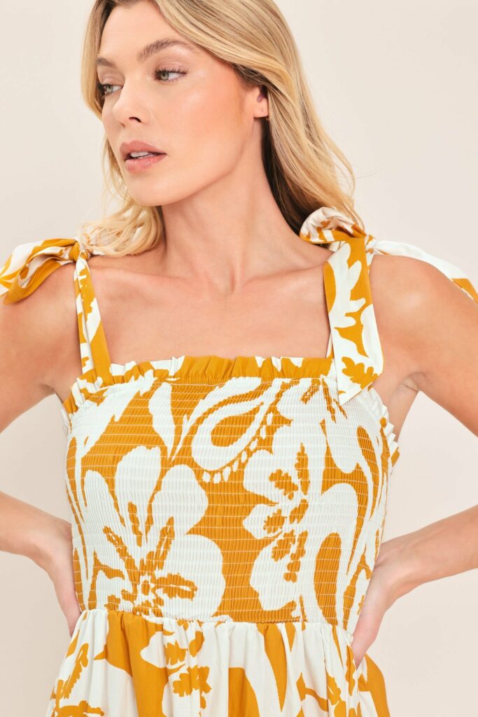
Florals are the most universally wearable print because they exist in so many forms — from a delicate scattered print to a bold oversized bloom. The key variable is scale: a small scattered floral reads as soft and feminine; a large-scale floral makes a statement. Choose scale based on how much visual impact you want the dress to have. Dark-background florals are more sophisticated and work for evening; light-background florals are more daytime and casual.
Stripes
The vibe: Clean, graphic, effortless — with strong visual direction
Vertical stripes elongate the body and add a clean, structured graphic quality. Horizontal stripes broaden and add roundness — which can work beautifully depending on what you want to emphasise. Diagonal stripes add movement and dynamism and are the most forgiving direction, because the eye follows the diagonal rather than stopping at any single point. Bold stripes need minimal accessories; thin stripes can carry more visual weight from styling.
Tropical / Botanical
The vibe: Resort, vacation, confident colour — made for sunlight
Large leaf prints, tropical blooms, botanical patterns — these are prints that were designed to be seen. They work best in natural light, at outdoor events, on vacation, or anywhere the setting can match the energy of the print. They’re harder to wear in urban or formal contexts, but in the right environment they’re spectacular. Style them simply — the print provides all the interest needed.
Abstract / Painterly
The vibe: Artistic, modern, more unexpected
Abstract prints — brush strokes, watercolour effects, irregular shapes — read as contemporary and artistic. They’re less traditional than florals and stripes, which can be exactly the right choice when you want to look interesting without going for the obvious. They often work in a wider range of contexts because they don’t have the strong seasonal or situational associations that florals and tropicals carry.
Geometric / Check
The vibe: Structured, smart, clean-lined
Geometric prints bring a graphic quality that reads as more structured and modern than organic prints. They work well in contexts where you want a polished, deliberate aesthetic — smart casual events, city dressing, occasions where a floral might read as too soft. Checks and plaid in dress form have moved far beyond preppy into genuinely sophisticated territory in recent years.
How to Style a Printed Dress Without Competing With It
The golden rule of printed dressing: the print is the statement, so everything else should support rather than compete. This means:
- Accessories in one of the print’s colours — pick up a single tone from the print and match an accessory to it. Instantly cohesive, looks intentional.
- Shoes in a neutral — nude, tan, white, black, or metallic. Nothing that introduces a new colour that isn’t already in the dress.
- One piece of jewelry maximum — with a print, you don’t need more. One pair of earrings, one necklace, or a single ring. Not all three.
- A bag in a solid neutral — the bag should recede, not compete. A bold print bag with a printed dress creates noise.
The Skin Tone Question
Certain print palettes do tend to work better with certain skin tones — warm earthy prints (rust, terracotta, warm green) typically flatter warmer complexions; cooler jewel tones and dusty pastels work better for cooler undertones. But this is a guide, not a rule. The most important test: when you put the dress against your face, does your skin look brighter or dull? If brighter, it works. If dull, try a different colourway.
From Sohitravel
Printed dresses in florals, stripes, and everything in between.
Our print collection spans every occasion and every aesthetic — each design chosen because it does what a great print should do: tell a story without saying a word.
